WayCarbon Design System
Function
Period
Tools
Tags
About
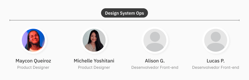
Design System Ops | Product Designer
December 2023 → ∞
Figma
Miro
Loop
Teams
Outlook
Figjam
Notion
Excel
UX
UI
Product Design
Case Real
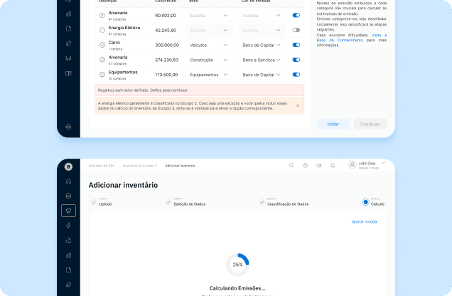
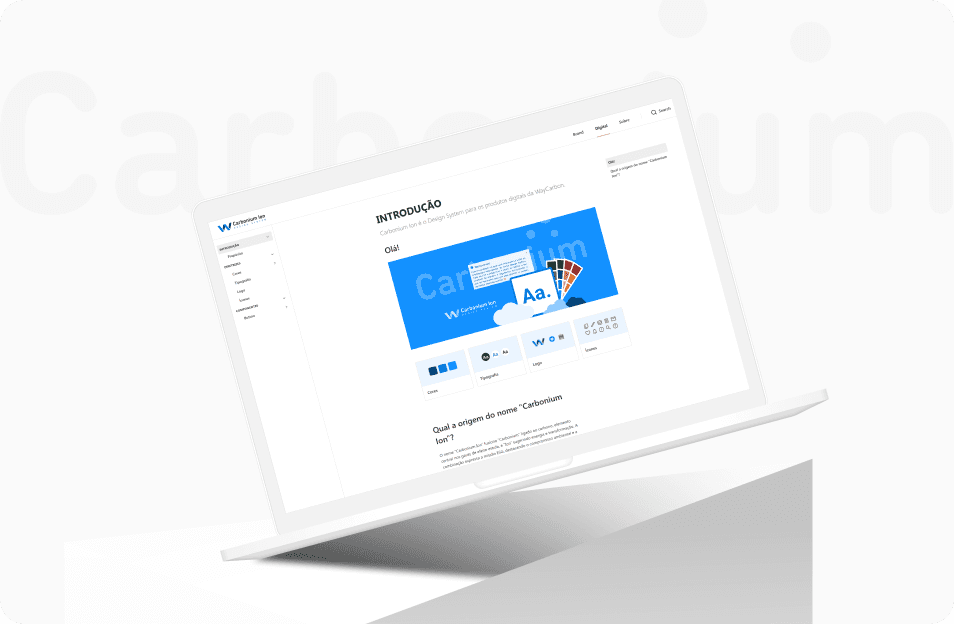
Carbonium Ion design system development process from WayCarbon Hub.
WayCarbon is a company focused on sustainability and climate change that started as a consultancy in the area and, after its acquisition by the Santander Group, has accelerated its expansion in the software development field.
As part of the founding UX team, with Michelle as one of the first Product Designers and me joining a few months later, we took on the challenge with our colleagues to create a working process from scratch.
Thus, one of the main initiatives was to develop a scalable design system that would serve all future products of the WayCarbon software hub.
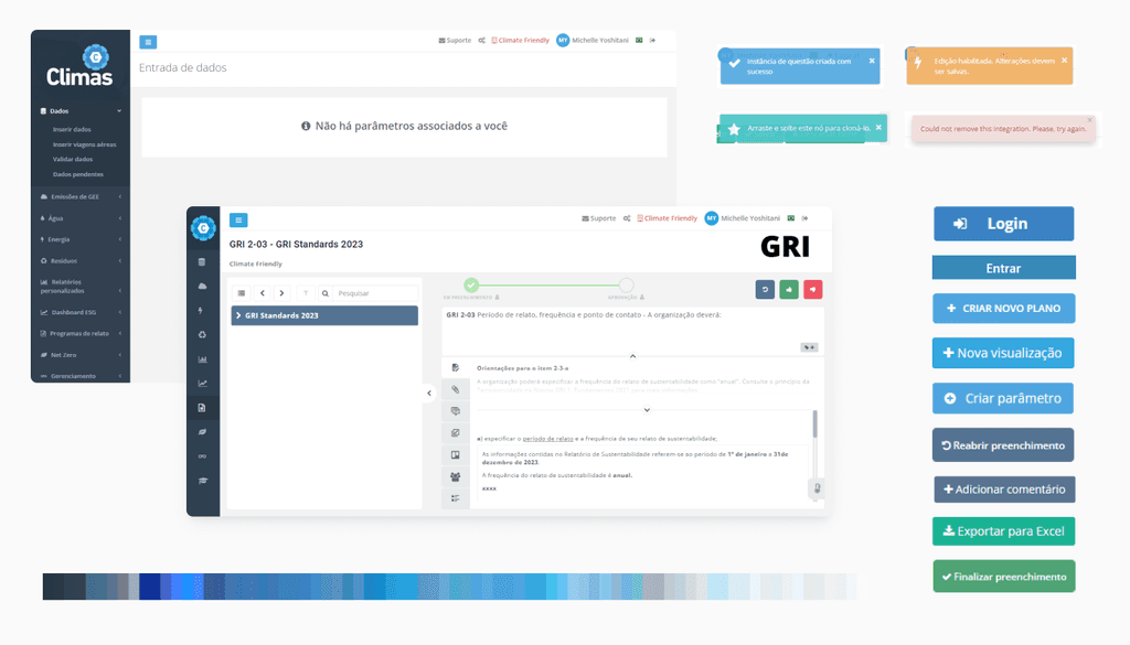
Currently, Climas, the company's ESG product, is seen as a legacy code system that, when conceived in 2020, digitized services already offered by consultants, but without prioritizing usability and accessibility. As a result, the interface lacks standardization and presents an inconsistent experience, with pages and interactions that vary significantly throughout the user journey.
In light of this scenario, the creation of a design system proves essential to ensure consistency and usability across all products. This project will not only solve current problems but also pave the way for digital products that reflect WayCarbon's values, consolidating its position in the corporate sustainability market.
We took on the responsibility of scaling the design system and consolidating it as an internal product, ensuring that it supports all the products in the WayCarbon portfolio with best development practices and positive impact. To achieve this, we worked closely with developers and involved stakeholders as needed, defining actions and priorities to meet short-term demands.
Given the tight deadline for delivering an initial style guide (essential for new products and improvements to quickly adhere to the design system), we prioritized components with the other Product Designers, identifying which were most urgent for a faster delivery.
The development of the style guide and the documentation of components was conducted simultaneously, organized in a squad format, which facilitated constant alignments with the developers responsible for implementation and resolving technical questions.
The squad, composed of designers and developers, followed a workflow previously agreed upon by the teams, allowing for a clear and structured process, which will be detailed in a later topic.
From the front created for the structuring and development of the design system, Carbonium Ion was born, an internal product with the mission of accelerating the development of new products and improvements, anchored in the best practices of design and development.
The choice of the name Carbonium reflects a direct connection to carbon, the basic element of life and also a central actor in discussions about sustainability, due to its role in greenhouse gas emissions. This term, in addition to referring to WayCarbon's mission in the environmental context, inspires the idea of versatility, given the diversity of compounds that carbon forms. The suffix "Ion" suggests movement and transformation, aspects that complement the proposal for innovation and agility of the design system. Ions represent electrically charged species, ready for interactions (a metaphor for the role of the design system as a facilitator of connection and cohesion between products, as well as its potential for continuous adaptation).
Thus, Carbonium Ion encapsulates both the fundamental values of the company and its proposal to develop technologies aligned with sustainability and environmental responsibility, projecting a scalable platform oriented towards innovation.
Previous initiatives to study information architecture and the overall usability of the system had already been carried out. Therefore, for the design system's Discovery, we consulted its documentation to extract insights relevant to our context.
In order to understand how the organization and hierarchy of the pages works, a sitemap has been created for a macro view of Climas, helping to comprehend the organization of the system interface through the structuring of all content, which pages are related and what their navigation levels are.
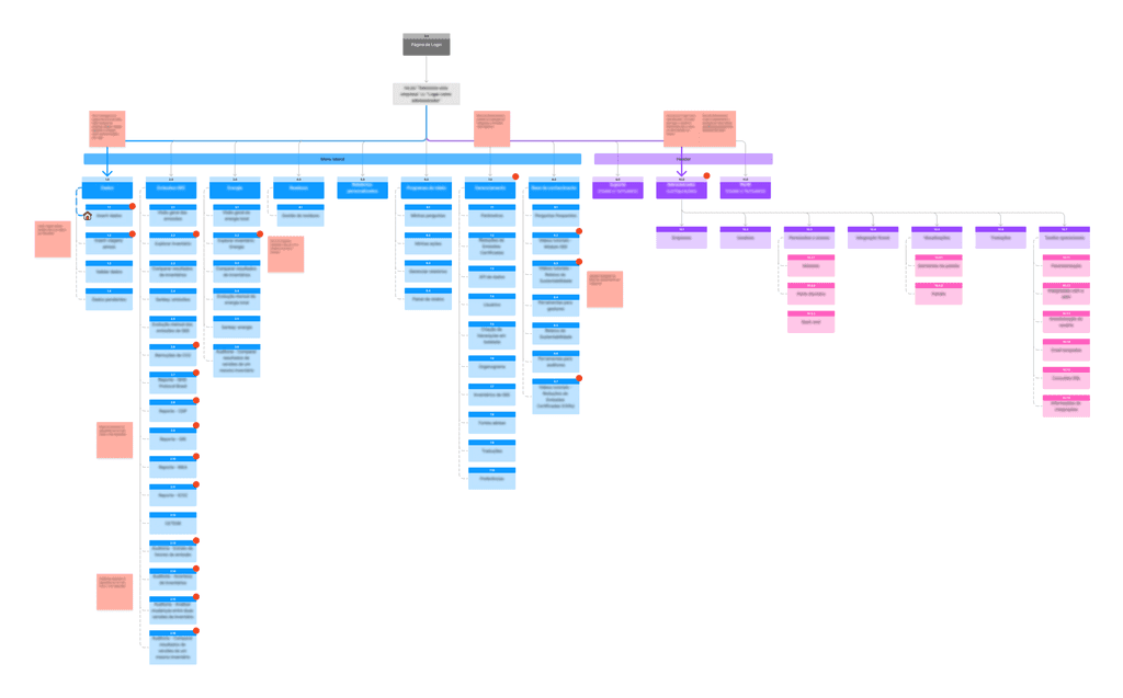
It is observed that there are two distinct large navigation journeys within Climas: the Administrator area (in purple) and the Management area (in blue), with the former being the environment where configurations and parameterizations are carried out (by the Support team) that reflect in the Management area, where the core of the product is concentrated.
When observing the organization of the menu, the pages, and the navigation flow within the product, it was possible to raise issues and questions regarding the identified frictions that were presented to stakeholders.
The mapping of the functionalities of the modules was carried out as a complementary study to the sitemap, where all the modules found in the system were mapped at various levels and sub-levels, along with the development of a succinct description of what each page entails, aiding our deeper understanding of the functionalities of the entire system.
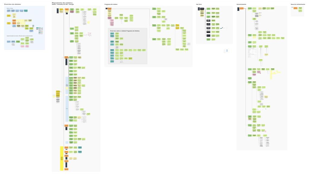
As complementary material to the investigation, a mapping of the Product Content Inventory was created in an Excel file to collect, describe, and catalog all published content formats within the system and, later in future studies, to use the same list as a basis for planning a new proposal for the hierarchical organization of the entire system.
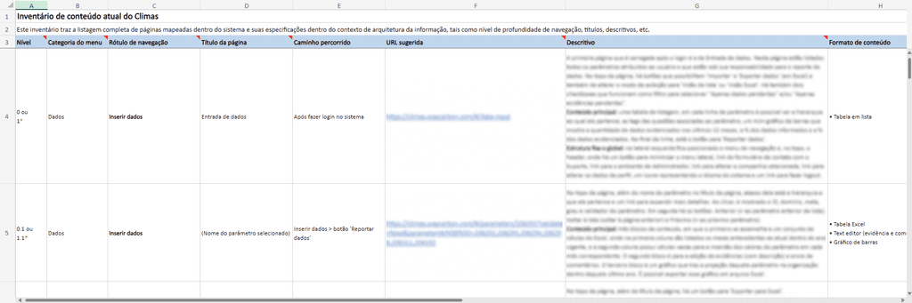
The spreadsheet prepared for the inventory provides a complete listing of mapped pages and their specifications within the context of information architecture, such as depth level of navigation, titles, path taken, suggested URL, descriptions, etc.
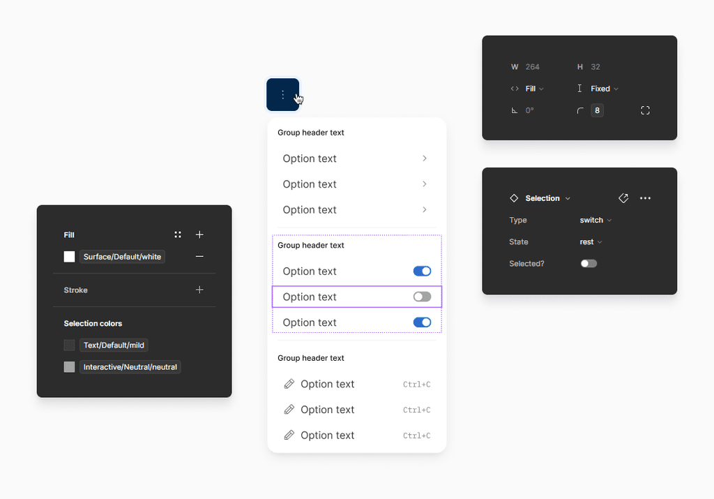
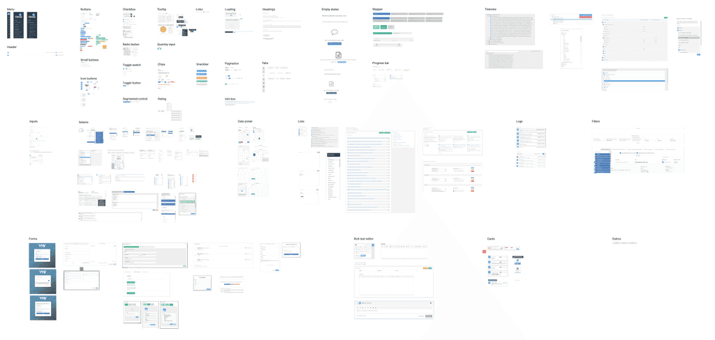
Alongside the Content Inventory, an Inventory of Components currently in use has also been created, with the purpose of extracting a mapping of all visual elements currently in use in the system, including everything from buttons and input fields to more complex elements like navigation bars and modals. In this way, it was possible to list and describe each component used in the system and the numerous style variations that could be found, assisting us in identifying the priority components for construction and also establishing consistent design standards for the Design System.
Com o mapeamento, foi possível observar alguns pontos como:
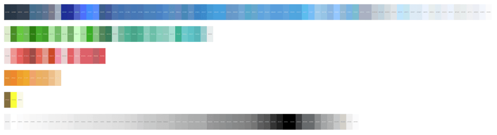
Many different styles for colors, fonts, button shapes, tables, icons, selects/text fields, modals, etc. Since these are elements that make up all the screens, the user has a different experience on practically every page.
The lack of visual hierarchy on screens, especially on input forms where fields and texts are very close to each other (and sometimes everything is in bold and/or with the same font size), makes it difficult to read the fields and to follow an order of filling out.
Many writing issues where descriptive texts such as buttons, instructions, status tags, page titles and subtitles, and text fields with labels do not provide clarity on what should be filled in. There are several situations where a button with the same functionality, for example, has different texts (e.g.: 'Excel', 'Export', 'Download Excel', 'Export Excel').
Action buttons placed in unconventional and unusual areas for the user (e.g., a 'Create new' or 'Next' button positioned at the bottom left of the screen).
During the presentation of the consolidated results of the study to the stakeholders, the need to prioritize the development of the design system as an internal product of WayCarbon as soon as possible was explained and reinforced again, in order to eliminate the pointed inconsistencies and ensure that the experience delivered to the user is familiar across all pages and modules of the system.
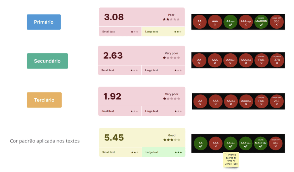
One of the most critical points of the system is, without a doubt, the violations of accessibility guidelines in digital products, where even the main colors used for buttons, links, and action components did not meet the necessary requirements.
In order to understand and identify, in a meticulous manner, all the accessibility issues of the system, a Discovery was conducted on Climas specifically focused on this topic, where each of the software's pages was evaluated thoroughly in relation to both Design and Development, following the guidelines of the WCAG (Web Content Accessibility Guidelines) in its most updated version, 2.2, as a study reference, where expected standards for digital accessibility are established by the institution within the four categories of P.O.U.R. (Perceivable, Operable, Understandable, and Robust).
For the evaluation, levels A and AA of WCAG 2.2 were considered, in which achieving level AA is the most recommended for the majority of web content, according to W3C. The tabulation of the evaluation results was prepared in an Excel document, to facilitate filtering the issues according to their guideline, category, and affected level.
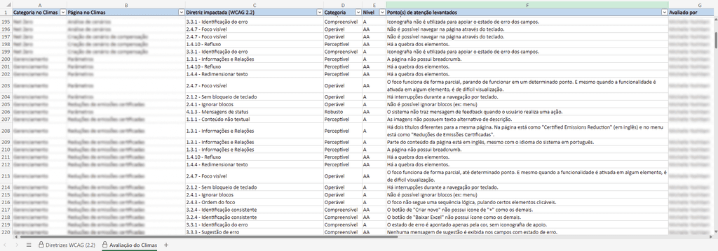
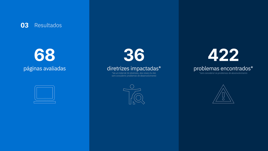
Through the results, some examples of the identified problems with the greatest impact were:
On almost every page, keyboard navigation is not smooth, with moments of interruption (such as breaks, pauses, or lack of logical order), in addition to other pages where the function could not even be enabled.
Even if keyboard navigation were possible, many components had a focus that was hard to see, or simply did not show any focus state (even with the function enabled for the component).
As mentioned in the previous phases of this case, there is a significant lack of standardization of almost all elements that make up the system interface, resulting in a lack of consistency in navigation, interaction, and even in the placement of elements.
Many fields in an error state had a generic support message, without guiding the user on how to correct the error, in addition to relying only on color change (e.g., red) to provide feedback, without the use of iconography.
On the "Knowledge Base" page of Climas, there are various videos and images in the tutorials but they do not provide alternative and accessible means for users with disabilities to understand this content (lack of subtitles and transcription in videos and alternative text in images).
All system pages have markup issues in their code, making it difficult for people with disabilities to use assistive technologies to navigate the product.
During the presentation of the consolidated results of the study to the stakeholders, the need for prioritizing the development of the design system as an internal product of WayCarbon as soon as possible, was again explained and emphasized, in order to eliminate the pointed inconsistencies and ensure that the experience delivered to the user is familiar across all pages and modules of the system.
As I have already mentioned, the culture of UX and Product is something extremely new at WayCarbon. With that, it is important to consider that a theme like design system, although of extreme relevance, may not be one of the simplest goals to prioritize in front of stakeholders when there is a need to develop products that will directly impact sales goals.
Thus, with all the initial research and the various presentations of the consolidated results as previously presented in this study, we appropriated more and more evidence and strengths to address the importance of the design system, in addition to its countless reasons to be an initiative to prioritize alongside other products. With that, a series of alignments with stakeholders was initiated, whether to defend the internal product or to show why using a specific tool was necessary to develop the Carbonium Ion DS.
After discussions and constant work to present reference data that strengthen the need for a design system to create better products (and in a more agile way for both design and development), we arrived at the moment to formalize the existence of our squad.
With our work front formalized and approved by the management of the company's Technology area, the time has come to define our workflow.
As both of us are responsible for the fronts related to the design system, it was necessary for the work planning to be well defined and for us to have traceability of everything that was being done, for mutual cooperation.
After a series of knowledge exchanges, previous experiences, and conversations, we established the end-to-end workflow presented below, from the identification of the need for a particular component to the final publication in the Design and Development libraries.
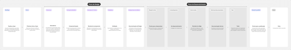
The columns within their respective lanes that comprise the entire workflow of the squad have been added and configured on the Carbonium Ion DS board within Azure DevOps, Microsoft's official project management tool for WayCarbon.
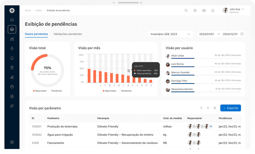
WayCarbon is a company with various types of fronts and products. Specifically speaking about its software, we currently have Climas, aimed at managing GHG emissions (the main tool of the company) and MOVE, focused on climate risk management.
In addition to the software, we also have the ESG Academy, our knowledge hub focused on sustainability and, of course, the company’s institutional website.
At this initial stage, the idea is for our design system to serve only digital software; however, when thinking about a design system that is scalable and to avoid rework, we need to consider from the beginning in which contexts it could be inserted in the medium or long term. To this end, we need to count on the cooperation of our marketing colleagues to better understand the identities of each product and their specificities.
In order for the Carbonium Ion DS to be conceived from the beginning as a design system that serves multiple brands, numerous studies and discussions were held to ensure that best practices were implemented during its construction.
The “Foundations” refer to the foundational elements that serve as a fundamental structure for the entire system of component and interface design. These elements include design principles and style guidelines that establish the basis for consistency and cohesion for the construction of the entire design system.
For the Carbonium Ion DS, we consider the following Foundations: colors, colors for data visualization, elevation, grid, spacing and column layout, iconography, logos, opacity, rounding, and typography. For all the Foundations, we also mapped their respective Design Tokens.
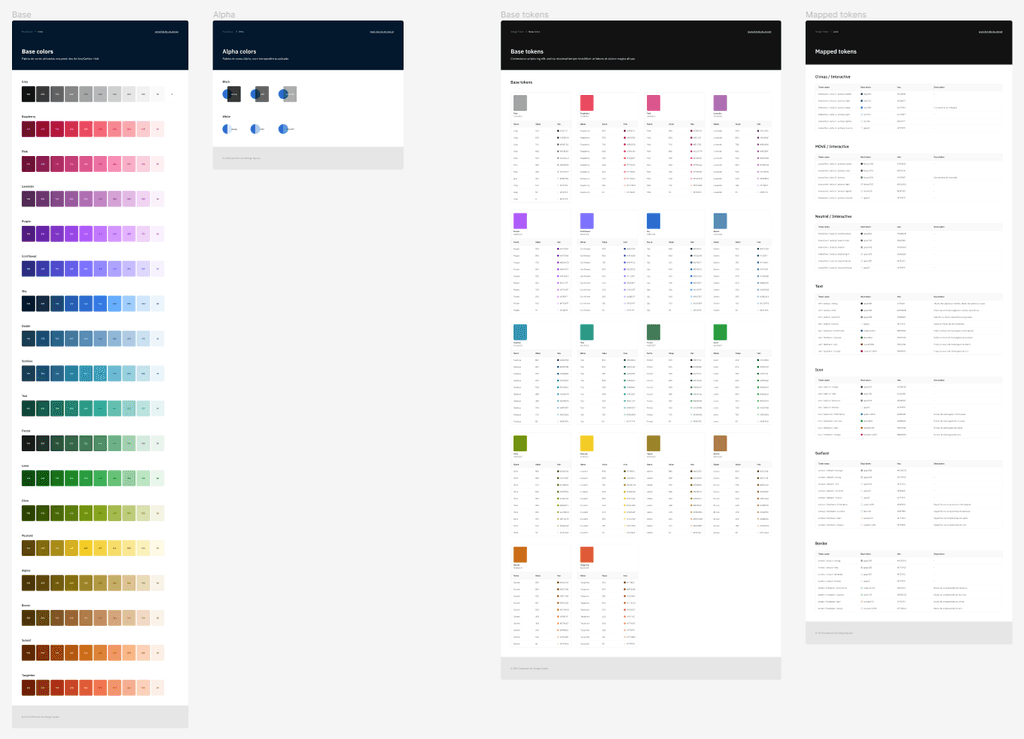
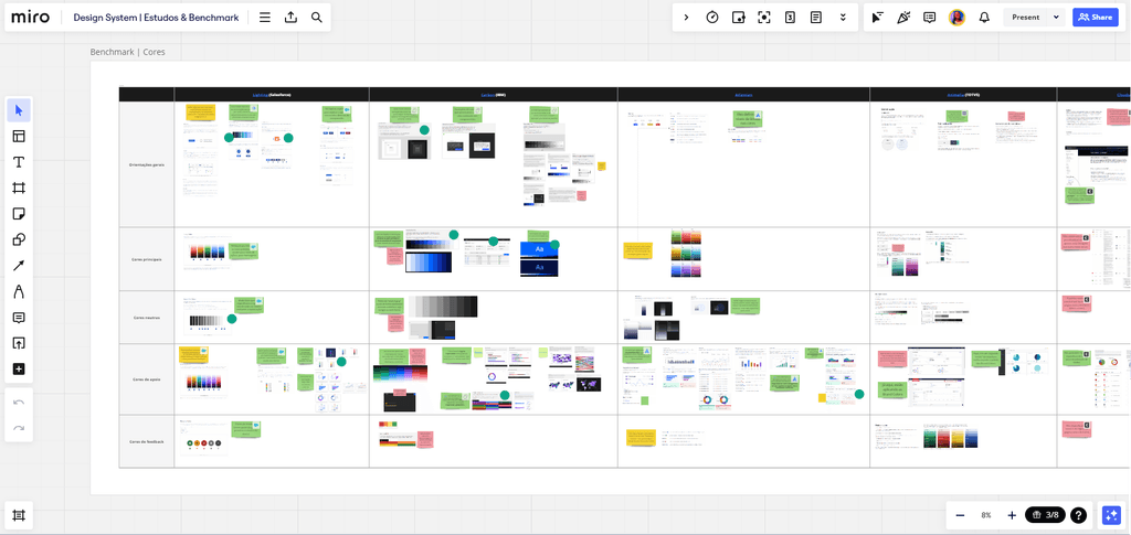
For the definition of each Foundation, the Discovery process was properly implemented in such a way that we sought the best practices related to both usability and accessibility, as well as what has actually been defined and implemented by the most established design systems in the market, with both functional and visual references, such as: Carbon (IBM), Material Design (Google), Fluent (Microsoft), and Spectrum (Adobe).
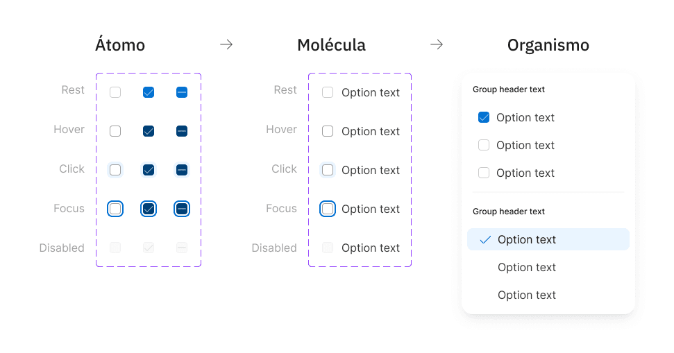
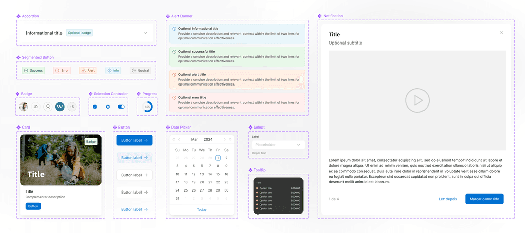
Based on the Foundations defined to guide the process of building the design system, we finally began the creation of various sets of components, based on the Atomic Design approach — a systematic approach to building scalable and cohesive design systems. This methodology is based on the idea that interfaces can be broken down into smaller and simpler components, called "atoms," which are combined to form more complex components, such as molecules, organisms, templates, and complete pages.
Building a design system from scratch also allowed us to incorporate accessibility guidelines as part of the process, ensuring both visually and technically that the components meet the needs of all people across different devices, considering points such as: checking color contrast in the different states of the component; checking the font size applied to texts, as well as the inclusion of labels, supporting texts, and appropriate iconography; adding markup in the HTML code for the correct reading and identification of elements, among other relevant points from the WCAG.
With a collaborative effort alongside the front-end developers assigned to the squad, all communication regarding the development of a specific component was ensured and reinforced, so that we could collaboratively ensure the most cohesive and correct implementation for both areas.
The documentation of a design system is a crucial part to ensure its effectiveness and usefulness, as it provides detailed information on how to use the defined components and patterns in the design system, with the goal of aligning all individuals involved in the process on the same line of reasoning regarding what is being built.
Just like the Component Review stage in the workflow, during the documentation of the components created for the style guide, we also organized ourselves to review what was documented by the other designer. For greater standardization and even to facilitate how the process occurs, we created a canvas for drafting the documentation, in which we included information about the component, such as what it is and what it is for, what the composition of its structure is, if there are variants and what they are, expected behaviors, basic application examples, and usage tips on what to do and what not to do at the moment of use.

After writing the documentation related to a specific component and the review by one of the respective designers, the documentation moves to our final repository: ZeroHeight. There, we created a space where all guidelines related to Carbonium Ion DS and other visual aspects of the company could be shared simply among the entire team.
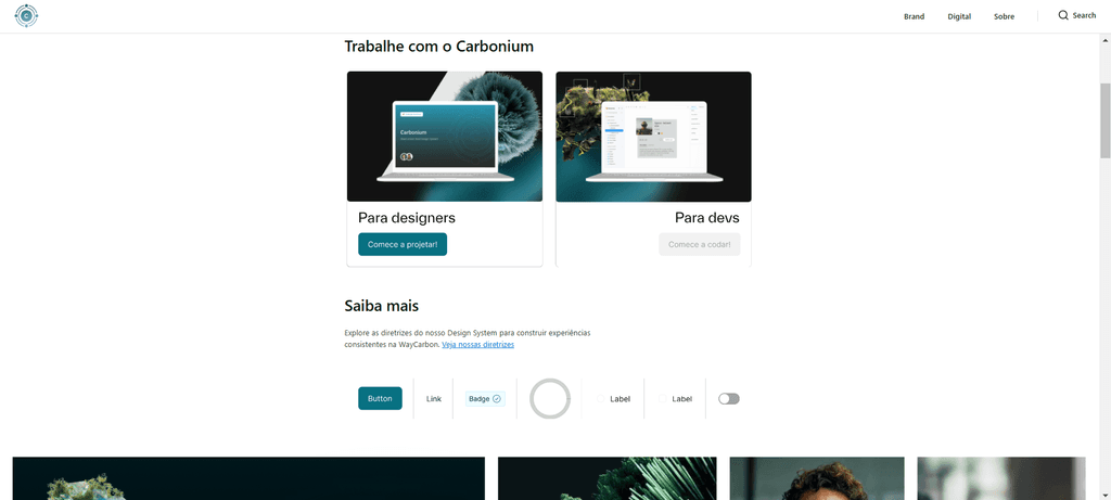
The implementation of Carbonium Ion DS unified the Design and Development approach at WayCarbon, establishing a common language and consistent structure for all team members. Now, designers and developers are aligned regarding standards, components, and design guidelines, which has drastically reduced communication noise and conflicts during the creation process.
With the introduction of the design system, there has been a significant increase in collaboration and co-creation between design and development teams. The existence of a centralized library of components and clear documentation has allowed everyone to work in a more integrated and effective manner, sharing ideas, feedback, and solutions in a more fluid and productive way.
One of the most relevant points to highlight is that, since its implementation, the design system has significantly accelerated the development process of new features and new products, both in the design process and in the coding itself, as can be evidenced by one of the newest modules of Climas, the ESG Maturity Assessment.
The implementation of the Carbonium Ion DS not only improved WayCarbon's internal processes, but also contributed to the optimization of the delivery and evolution of its products. The solid foundation and unified approach to Design and Development resulted in significant improvements in both the quality of the produced interfaces and the agility of development.
The design system promoted the protagonism of the design and development team in relation to the other areas of WayCarbon. By establishing a common language and consistent standards, the team became a focal point, driving innovation and the progress of the company as a whole.
It is planned to extract metrics on access, consumption, and usage of Carbonium Ion DS throughout the company. This data will be essential to provide insights into the impact and effectiveness of the design system in different areas, allowing for continuous improvement opportunities and adjustments as necessary.
Thank you for viewing this far!