Function
Period
Tools
Tags
About
Product Designer
February 2022 → March 2022
Figma
Figjam
Notion
Google Meet
Google Sheets
Gmail
UX
UI
Product Design
Case de Estudo
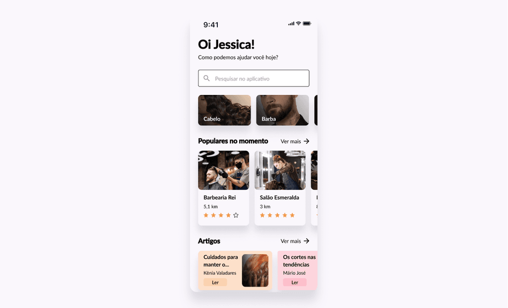
With Sbace, consumers can find beauty salons, check available dates and times, and schedule the desired service easily.
Goals
Primary
Create a more modern scheduling solution for beauty salons, especially small entrepreneurs who do not have large structures or extensive capital to invest in technological solutions.
Secondary
Facilitate access to different information and tips about hair care, skin care, and general aesthetics.
Provide personalized experiences for each user based on their individual characteristics.
Create a space where everyone feels welcome, where it is possible to find salons and receive useful content.
For the development of the project, I chose to use the Design Thinking Framework as a guide. Usually interpreted simply as a set of practices and processes, Design Thinking is an iterative, non-linear, and user-centered method that consists of 5 main phases, namely Empathize, Define, Ideate, Prototype, and Test.
Prototype
In the user's shoes
Como pontapé inicial para o projeto, resolvi dar sequência com 2 métodos de pesquisa para conquistar maior embasamento sobre o assunto e empatizar com o usuário, sendo eles melhor descritos a seguir.
Desk Research;
1:1 Interview.
Define the target audience;
Identify and analyze competitors;
Understand how people usually schedule appointments at beauty salons;
Understand types of services offered in a salon;
Comprehend diversity in the beauty market.
How do people usually schedule appointments at beauty establishments?
In their daily lives, do people care about hair care and aesthetics in general?
What do individuals seek as a differential in a beauty salon?
View research plan
Desk research
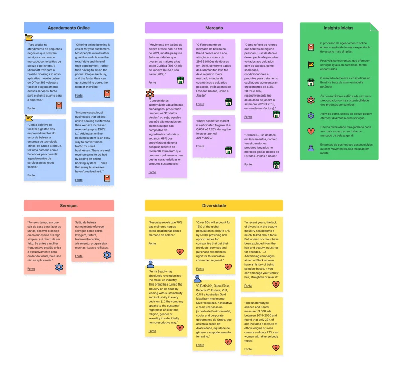
In search of further depth on the topic and to validate the initial assumptions, a research was initiated through articles and papers.
View affinity diagram
Através da breve pesquisa inicial, foi possível tirar considerações sobre o mercado de beleza atual.
There is a high demand in the Brazilian beauty market for products ranging from hair care to skincare.
After the decline experienced at the beginning of the pandemic, the market has shown signs of growth again.
An increasingly prevalent concern in the global
beauty market.
Individuals participating in a NielsenIQ survey claim to seek out products that are not tested on animals.
1:1 Interview
At this point in the project, I had gained a deeper understanding of the topic and developed some hypotheses based on the research conducted. However, it was necessary to delve further into the discussion and seek to understand the difficulties and needs of the user, as well as to validate the initial insights.
Individuals who regularly visit beauty salons.
Participants should be between 20 and 45 years old.
Among the participants, there should be a wide variety in terms of gender, race and ethnicity.
Type: Remote.
Location: Brazil.
Duration: 25 to 30 minutes.
Participants: 6 (between 20 and 45 years).
View research plan
View affinity diagram
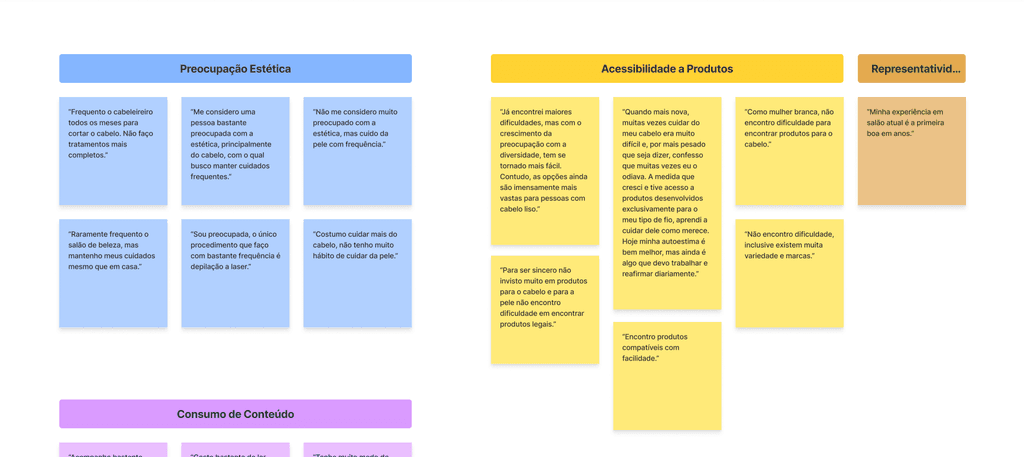
The majority of users consider themselves concerned about aesthetic beauty.
The participants take care of their hair or visit the salon even if only for a haircut.
Accessibility to products appears to be more difficult for Black individuals, although this has been improving.
Some individuals note difficulty in having good experiences at salons or finding a salon compatible with them.
For some, hair directly reflects on self-esteem.
It is common for them to follow beauty content, whether on social media or through reviews or articles.
Sustainability is important to some individuals, while others admit that it should be taken into consideration. For others, it is not relevant.
Based on the insights gathered from the Desk Research and 1:1 Meeting, it is time to analyze the information and define the target audience, taking into account their characteristics and other relevant information.
Personas
In order to encompass a considerable range of users and keep them in the forefront during decision-making from this point on, personas were created based on extremes of profiles found during the initial research.


Analysis of user needs
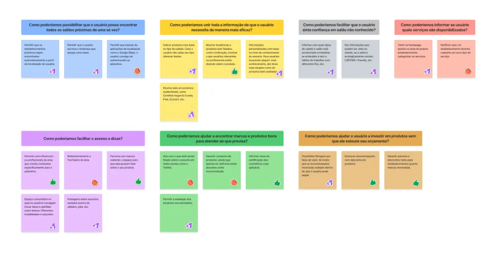
After completing the implementation of the personas for the project, the process continued with the listing of each specific user and their main problems. The "How Might We" method was chosen to generate some more ideas from questions that can guide the current creation process.


User Journey Maps
To proceed with the project, we have chosen to structure journey maps for each of the personas shown in order to highlight their steps during the execution of a specific task until they achieve their goals.


Based on insights and possible design concepts, it's time to brainstorm and sketch different ideas that could meet the needs effectively and address the difficulties.
Benchmarking
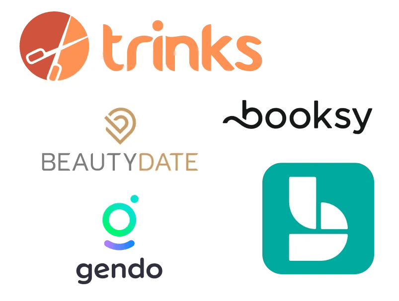
With the aim of analyzing the competition, their strengths as well as points for possible improvements, some applications that offer similar or identical services were analyzed.
View competitive analysis
Through the analysis of different aspects of competing businesses, opportunities were observed.
Accessibility
Enable support for various languages so that language does not become a barrier.
Diversity
Provide a language less tied to binary concepts, so that every user feels welcome and included.
Filtering
Filtering features that provide greater control for the user, allowing them to find what they need in a simpler and more direct way.
Hierarchy
Pay attention to visual standards and writing so that information is displayed consistently and organized.
Brainstorming
Based on the information gathered through the How Might We method and benchmarking, it was decided to proceed with a brainstorming session.
View questions and insights
For the definition of what would be implemented initially, the ideas were prioritized. Thus, the ideas were categorized as P1 and P2, with P1 being the highest priority and to be implemented initially. Ideas defined as P2 may be reassessed and implemented later.
P1
Allow nearby establishments to be found automatically based on the user's location.
P1
Allow the user to input the desired address as a base.
P1
Recommend products based on hair type and interests that will be queried during onboarding.
P1
Informações personalizadas com base no nível de conhecimento do assunto. Para usuários buscando adquirir mais conhecimento, dar dicas mais simples como de produtos bem avaliados.
P1
Display badges on sustainable products, such as Certified Vegan & Cruelty Free, Ecocert, etc.
P1
Provide information on the types of hair the salon is accustomed to working with, whether they understand and have a habit of working with hair types, etc.
P1
Categorize services both on the homepage and in the establishment's own area.
P1
Postagens sobre assuntos variados acerca de cabelos, pele, etc.
P1
Community space where users can exchange beauty tips and opinions. Different modalities and subjects.
P1
Allow users to rate the recommended products.
P1
Enable filtering by price range, so that the recommendations shown are within the user's budget.
P2
Ensure partnerships and discounts for both establishments and renowned brands.
P2
Highlight recommendations with discounts on products.
P2
Display certification for cosmetics if applicable.
P2
Partnership with influencers or industry professionals to create content specifically for the app.
P2
Partnership with brands to provide space for them to talk about their product.
P2
Show trends and well-received products. Alongside the recommendation, display what relevant users or professionals are saying about the product.
P2
Tab showing what is being discussed about the topic on social media platforms like Twitter.
P2
Ensure product curation, with only the best products being featured as recommendations.
P2
Redirect to creators in the field.
P2
Allow users to be redirected to the app through location-based applications like Google Maps.
P2
Notify if a favorite establishment registers a new type of service.
Appmap
To better understand the overall landscape, screens and respective functionalities of the application, an app map was developed, a visual representation whose main purpose is to serve as a map of the pages that can be visited in a system.

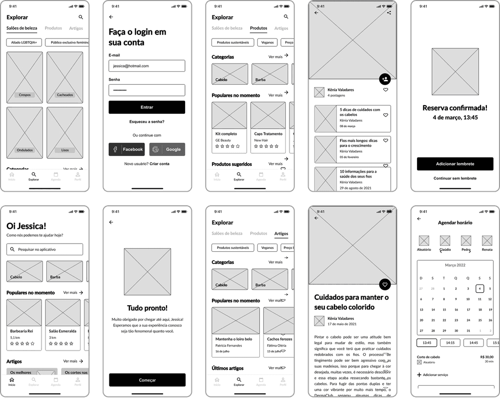
Wireframes
With the architecture defined, the main screens of the application were sketched based on quick scribbles. Some low and medium fidelity versions were developed as a basis for defining the interface.
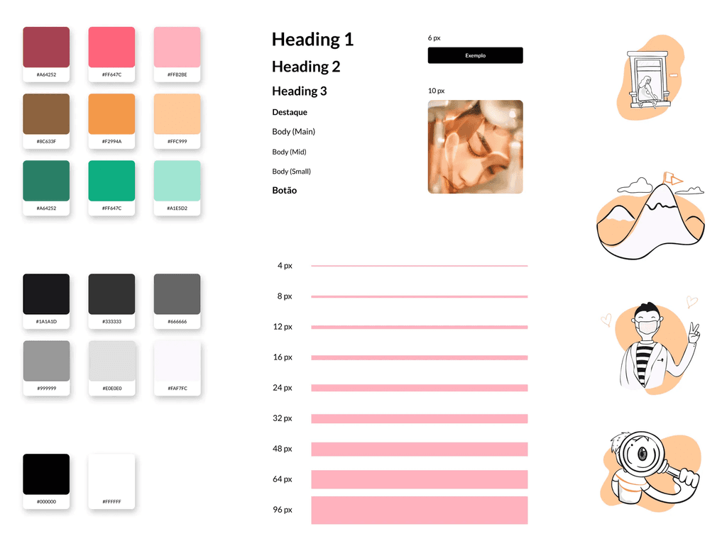
Style Guide
For guidance during the visual and UI process, a style guide was created containing color palette, typography and other details covering the visual aspects.
Test time
In order to ensure that the proposal presented is a viable solution for the target audience, a usability study was conducted with potential users.
Information regarding the study in question is provided below, as well as an overview of the most relevant information acquired during the user testing.
Study objectives
To check whether users can perform tasks in the application and how, whether easily or with difficulty.
If there are difficulties, document them for improvements.
To test the applicability of the service.
Methodology
Type: Remote.
Location: Brazil.
Duration: 25 to 30 minutes.
Participants: 6 (aged between 20 and 45).
View usability test plan
Métricas
Task completion time.
User error rate.
Task completion rate.
Script
Step 1: Create an account. How was the process? Would you change anything?
Step 2: Schedule an appointment at Barbearia Rei. How was the process? Would you change anything?
Step 3: Add an article to favorites. How was the process? Would you change anything?
Step 4: Access the profile of an article author. How was the process? Would you change anything?
Step 5: Access address information. How was the process? Would you change anything?
Through the feedback collected from users, it was possible to understand that the application delivers a satisfactory result. However, there is room for potential improvements.
An option to confirm the password would be beneficial when creating an account.
Requesting the complete address during registration.
The user flow upon completing the booking needs to be reviewed.
The booking screen can be made more intuitive.
More information about the author of the post.
Use of icons in the "Profile" section.
Prototype
Want to take a look at the end result? Browse in high fidelity!
Thank you for viewing this far!